Website analytics have gotten so much more sophisticated. While Google analytics are still a vital part of analyzing website traffic, marketers are diving deeper to understand how users are interacting on the site through tools like heat mapping. It’s been shown that tiny adjustments in the UX (user experience) on a website can pay off with lifts in conversions. When the conversion could mean the sale of a home, you are talking about a significant amount of revenue to gain. Let’s dive into the three types of heat mapping and why they are becoming an important part of the marketing toolbox.
Scrolling Heat Map
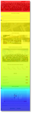
A scrolling heat map shows how far visitors are scrolling down each page of your website. Marketers have long understood the value of website real estate that lives above the fold, but a scrolling heat map goes deeper giving valuable details on what percentage of the audience drops off on the journey down. The concept of get-to-the-point really rings true here.
How To Use A Scrolling Heat Map
Landing pages should be split tested with different layouts and designs to see which one produces the best results. Results = Red, orange, and yellow further down on the page. You can combine this information with the next two heat maps to find the perfect formula for your layouts.
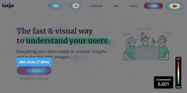
Photo courtesy of Hotjar
Click Map
Most of us have a great idea of the content that engages home shoppers, right? Maybe? Click maps are the sure-fire way to understand where visitors are clicking on your site. Click maps follow mouse clicks on desktop. A click map lets you visually at-a-glance see which calls-to-action and pages on your navigation are getting the most clicks.
How To Use A Click Map
If a call-to-action on your page isn’t getting high engagement, you can use clues from your most clicked pages to update wording, button colors, or content. By taking an initial measurement, you can then test your hypotheses with split tests to see if any of the changes produced better results. It’s the scientific way to enhance your website.
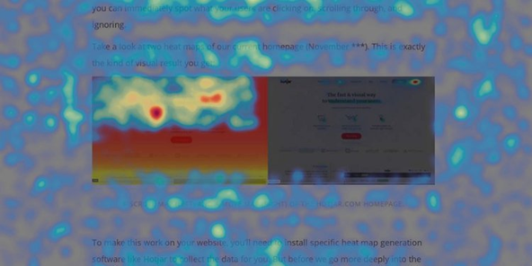
Photo courtesy of Hotjar
Move Map
A move map shows how a visitor’s mouse moves across the page and where the concentration of the activity is located. It’s a sophisticated way to see what is capturing their attention. It could be an image, graphic, or one of your homes.
How To Use A Move Map
Move maps can give great insight into what content is driving engagement on your website. Is it interior renderings and photos or exteriors or the link to your virtual tour? A move map can give you great insight into what’s working and what’s not.